![PNG Transparent background-1.png]](https://support.cibolabs.com.au/hs-fs/hubfs/PNG%20Transparent%20background-1.png?width=215&height=76&name=PNG%20Transparent%20background-1.png)
Download dummy ground cover benchmarking report - CLICK HERE
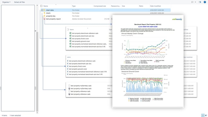
When you download a 'Ground Cover & Woody Vegetation Report' you will receive a zipped folder containing the following:
- Chart Data
- Charts
- Ground Cover and Woody Vegetation Report (PDF)
Annual Woody Vegetation Cover Change Reports
The woody vegetation trend analyses use data adapted from the Department of the Environment and Energy (2019). National forest and sparse woody vegetation data. Version 4.0. Commonwealth of Australia, Canberra.
Landsat satellite imagery is used to derive woody vegetation extent products that discriminate between forest, sparse woody and non-woody land cover across a time series from 1988 to 2019. A forest is defined as woody vegetation with a minimum 20% canopy cover (CC), potentially reaching 2 metres high and a minimum area of 0.2 hectares. Sparse woody (woodland) is defined as woody vegetation with a canopy cover between 5-19%.
Primary forest (>=20% CC) or woodland (5-19% CC) refers to woody vegetation that has been undisturbed since at least 1988. Secondary forest or woodland has been disturbed at anytime since 1988.
The Annual Woody Vegetation Cover Change Report provides information on the reported total extent of woodland and forest over time (the left axis and solid lines) and apparent annual loss rate (dotted lines and right axis) for primary and secondary woody vegetation (forest and woodland). The time-series display tool can be used to visualise where in the landscape these changes have occurred.
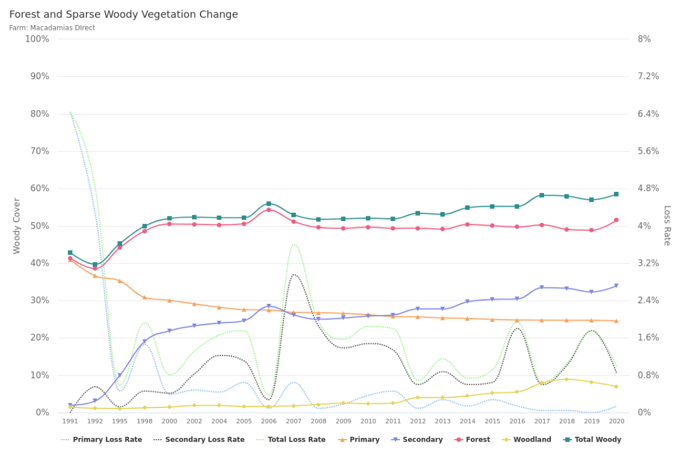
Figure 1. Example report showing annual changes in woody vegetation extent (solid lines) and apparent annual losses (dotted lines).
So what story does the above woody vegetation cover graph tell us?
The above graph shows a very low overall amount of woody cover starting with 4.5% of the report area in 1991 and a decrease in forest and woodland extent from 1991-2006 to about 2% of the reporting area with apparent losses of both primary and secondary woody vegetation. Since 2012 there has been a net increase in the extent of woody vegetation. The extent of woodland has remained relatively constant with most of the increase associated with forest. The greatest loss rate was in 2006 with over 20% of the woody cover being lost.
Seasonal Ground Cover Reports
Six time-series graphs are produced using median seasonal ground cover estimates based on Landsat satellite data using methods developed by the Joint Remote Sensing Research Program and adapted by Cibo Labs. Below these are the monthly gridded rainfall data sourced from the Bureau of Meteorology. The graphs provide the long term trends in ground cover over a property and allow the property to be compared to reference properties (e.g the adjacent properties within 5km) and the surrounding biogeographic region. If we can assume the comparison areas on similar land types have received similar rainfall, then differences in ground cover can generally be interpreted as land management effects.
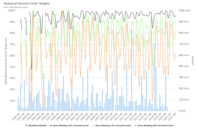
So what story does the above seasonal ground cover graph tell us?
Generally ground cover across a property can be highly variable depending on land management practices and land condition. For example, a property might have generally high ground cover levels, but some localised areas with much lower ground cover levels that may be at risk of erosion. Using a single statistic such as the average or median seasonal ground cover for the entire property would potentially be very misleading. For the property in the example above, while drought conditions over the last 10 years has seen an overall decline in ground cover (as would be expected), this particular property has generally maintained greater than 75% seasonal ground cover levels over 75% of the area, (see the 25th percentile) except for the extreme drought year of 2020. The property has also generally had greater than 50% seasonal ground cover over 90% of the property (see the 10th percentile), and less than 1% of the property has been below 50% seasonal ground cover during 5 dry seasons in the last 10 drought years.
 Figure 3. Seasonal Ground Cover Benchmarks compared to the Reference Area - The graph above compares the median (50th percentile) ground cover of the property to the 5th, 25th, 75th and 95th ground cover percentiles of the selected reference area (e.g. the properties within 5km). The blue line is near the 75th percentile of the reference area which means the median ground cover of the property is higher than around 75% of the selected reference property area.
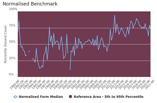 Figure 4. Normalised Seasonal Ground Cover Benchmarks compared to the Reference Area - This graph compares the median seasonal ground cover of the property relative to the selected reference area seasonal ground cover (5th and 95th percentile are represented as the 0% & 100% respectively) . For example, if the median ground cover of the property is higher than the selected reference area it will be above the 50% line. In this example, in recent years the property has been around the 75th percentile and significantly improved relative to the neighbours.
So what story does the above seasonal ground cover benchmark graph tell us about the property?
The 2 graphs above tell a fantastic story about the positive impact of changing grazing management on ground cover, and overall productivity. The current owners took over the property around 2010 when ground cover levels were similar to or below neighboring properties. Despite drought conditions causing an overall drop in ground cover over the last 10 years, their ground cover levels relative to neighboring properties have improved due to infrastructure development and grazing management. Not only have their stocking rates increased, but ground cover levels are now around the top 25% compared to their neighbors.
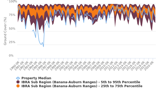
Figure 5. Seasonal Ground Cover Benchmarks compared to the IBRA Sub Region - The graph above compares the median (50% percentile) ground cover of the property to the 5th, 25th, 75th and 95th ground cover percentiles of the surrounding IBRA Sub Region. If the blue line is near the 75th percentile it means the median ground cover of the property is higher than approximately 75% of the the surrounding IBRA Sub Region. If the blue line is below the 25th percentile the it means the median ground cover of the property is lower than approximately 75% (or the lowest 25% in terms of area) of the the surrounding IBRA Sub Region
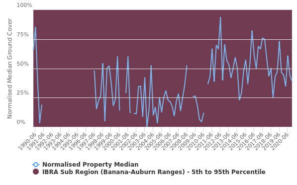
Figure 6. Normalised Seasonal Ground Cover Benchmarks compared to the IBRA Sub Region - This graph compares the median seasonal ground cover of the property relative to the IBRA Sub Region seasonal ground cover (5th and 95th percentile are represented as the 0% & 100% respectively) . For example, if the median ground cover of the property is higher than the the IBRA Sub Region it will be above the 50% line.
So what story does the above seasonal ground cover benchmark graph tell us about the property?
Not only have the owners of this property improved the ground cover levels compared to their neighbors, but they have also dramatically improved ground cover compared to the district. Prior to 2010 ground cover levels on this property were generally well below others within the Banana-Auburn Ranges Biogeographic Region, and in some years below the 25th percentile. Importantly, there is a significant rainfall gradient across the region with this property receiving less than the long-term regional average rainfall. In recent years the property has generally been above the 50th percentile, suggesting the new property owners have significantly improved their ground cover.