![PNG Transparent background-1.png]](https://support.cibolabs.com.au/hs-fs/hubfs/PNG%20Transparent%20background-1.png?width=215&height=76&name=PNG%20Transparent%20background-1.png)
The Dashboard
Upon accessing the Cibo Labs dashboard the 'My Farms' section provides you with your farm details and ability to view and manage all features.
The list and grid views give you access to a range of details including farm name, farm ID(PIC) and Size closely associated with features such as Maps, Reports and Assessments, and management functions, Manage to edit parcels and paddocks and Share.
List View:

Grid View:

| Function Key |
Function Description |
 |
Farm Maps - Farm maps include both AFM and/or PastureKey services. Users can access farm maps, imagery layers, charts, data files and the forage budget calculator for PastureKey subscription holders. |

|
Reports - Farm Reports are accessible, providing the ability to access all downloaded data files, requested from the map layer and acts as an archive. Additional farm and paddock-level reports can be ordered in this section, more information regarding these reports can be found HERE. |
 |
Forage Budget Calculator Tools - Only accessible by PastureKey subscribers, the farm and paddock level calculators are auto-populated with pasture data to proactively assist users in managing feed demand and supply decisions using Animal Equivalent (AE) or Dry Sheep Equivalent (DSE) systems. |
|
|
Get PastureKey - Indicates that the farm is available to activate a PastureKey subscription. Users can set up their PastureKey service including mapping their paddocks, request processing of the paddocks and access maps while in the 30-day FREE trial of PastureKey. |
|
|
In PastureKey Trial - Indicates this property has started a 30-day FREE trial of PastureKey. |
|
|
Manage - allows users to update or edit your farm or paddocks(PastureKey only). This includes changing, deleting farm parcels that are no longer a part of your property or to create an additional farm on the associated PIC. |
|
|
Share - function is aimed at producers who may consult with third party members (i.e. consultants or advisors). You can share your AFM data with a third party member, provided they have a Third Party Subscription on the Cibo labs platform. |


To share your PastureKey service with other members in your organisation requires account sharing access. This can be completed from the PastureKey subscription owners account.
Demo Farms
You can also view our Demo Farms by clicking 'Show Demo Farms' in the top right corner of your dashboard. 
You will see a Demo Farm and associated details appear in a window above your current dashboard. This Demo Farm allows users to take a look at both an AFM and PastureKey service. PastureKey is our subscription-level service and this Demo Farm will provide insight into what's on offer if you choose to upgrade.

Maps are accessible via ![]() including the option of viewing:
including the option of viewing:
1. Base Map layers
2. AFM Map layers
3. PastureKey Layers (PastureKey Subscribers).
A useful resource to compare map services please refer to: What's the difference between the Australian Feedbase Monitor (AFM) and PastureKey?
1) Maps
Features and Functions:
Map layer view, enables the user to elect their preferred 'Base map' view, and then to select and review PastureKey service layers.
Left Pane Menu:
| Features and Functions | Description |
|
Farm Name |
Background map imagery the user can choose to view there property layers behind. |
|
Get Reports |
Allows the user to access farm reports and the data section of the dashboard. |
| Zoom: + or - | Utilise the plus and minus before panning around the map by clicking and dragging with your mouse |
| Center view | Allows you to geolocate your current location |
| Cog | allows you to access the "manage farm" options such as editing farm or paddocks. |
| Help | Help Tools for the Map and services |
Time slider:
| Features and Functions | Description |
|
Time slider bar |
The ability to move backwards and forwards through the date ranges. |
|
Date |
Identifies the date that the data capture was taken |
| Data download | Access all recent PastureKey data files from data captures including CSV files and imagery. |
| Forage Budget Calculator | Access farm and paddock level forage budget calculator for both AE and DSE production systems. |
View service layers including Base, AFM and PastureKey layers using the 'show layer' icon in the top right of the screen. An overview of each layer has been outlined below.
A) Base Map Layers
Map layer view, enables the user to elect their preferred 'Base map' view, and then to select and review PastureKey service layers.
| Base Map layer types | Description |
|
Esri World Mapbox satellite Open Street Map Mapbox Street layers |
Background map imagery the user can choose to view there property layers behind. |


From this point after selecting AFM Layers, users can access a number of imagery layers of there properties land parcels.

The 'Reports' widget will open a new tab which provides a list of three different types of examples of reports that can be generated using AFM directly.

Click "Reports" in Demo Farm to view the three different report types available.

Reports options examples in the Demo Farm File archive include:
- Groundcover and woody vegetation - zip file.
- FarmKey - zip file.
- Pasture Biomass - zip file.
More information regarding these reports can be found HERE.
To learn about different types of Pasture Key Data available please refer to the PastureKey Users Guide
The AFM Map Layers
This service provides users with the ability to view in real time, their whole property pasture performance based on 5 day Total Standing Dry Matter captures displayed as a 30 day rolling median at 80m resolution. This provides you with insights to understand the median pasture performance and the range of TSDM across your property. You also have the ability to analyze monthly historical data for your property back to 2017.
There are eight different map layers provided to users. Below is a brief summary of these available layers:
|
AFM Map Layer Options: |
Description/Definition: |
| Satellite View |
Satellite View (Satellite View) Enhanced Natural Colour Satellite Image - Sentinel-2 10m resolution, multispectral imagery using bands 11 (SWIR), 8 (NIR) and 4 (Red) displayed as red, green and blue respectively. Bright green represents vigorous, healthy vegetation including forests, crops and growing pasture. Dry forests and woodland appear in a muted green through to browns. Sparsely vegetated, dry pasture and bare areas appear brown and mauve showing variability in soil colour. |
| Pasture Biomass |
Total Standing Dry Matter (TSDM) - The total amount of pasture, measured in kg/ha, after the water content is removed. It includes both green (actively growing plant material) and dead (senesced standing material) but excludes plant litter. The map legend symbology and displayed unit of measure on this layer is represented by:
|
| Dead Pasture Biomass |
Dead Standing Dry Matter (DSDM) – The amount of non-photosynthetically active plant material, such as dead leaves and stems in kg/ha. This is one component that makes up TSDM (Kg/Ha). The map legend symbology and displayed unit of measure on this layer is represented by:
|
| Green Pasture Biomass |
Green Standing Dry Matter (GSDM) – The total amount of photosynthetically active growing plant material in kg/ha. This is the 2nd component that makes up TSDM (Kg/Ha). The map legend symbology and displayed unit of measure on this layer is represented by:
|
| Pasture Biomass Deciles |
Monthly Pasture Biomass Deciles - The ranking of monthly Total Standing Dry Matter relative to all the previous estimates for that month over the length of record since 2017. The map legend symbology and displayed unit of measure on this layer is represented by:
|
| Fractional Cover |
The percentage of ground covered by three key components: photosynthetically active vegetation (green), non-photosynthetically active vegetation (dead or dry), and bare ground. The three proportions add to 100%. Vegetation includes grasses, forbs, shrubs and trees. The map legend symbology and displayed unit of measure on this layer is represented by the legend:
|
| Total Cover |
Derived from Fractional Cover. The combined percentage of ground covered by green, dead or dry vegetation. Vegetation includes grasses, forbs, shrubs and trees. Total cover % = green cover % + dead or dry cover %. Also, Total Cover % = 100% - Bare Ground %. The map legend symbology and displayed unit of measure on this layer is represented by:
|
| Woody Cover |
Primary and Secondary Forest and Woodland Cover - A forest is defined as woody vegetation with a minimum 20% canopy cover (CC), potentially reaching 2 meters high and a minimum area of 0.2 hectares. Sparse woody is defined as woody vegetation with a canopy cover between 5-19%. Primary forest (≥20%CC) or woodland (5-19%CC) is defined as woody vegetation present in 1988. Secondary forest or woodland has been disturbed at anytime post-1988. "Woody" is inclusive of both forest and woodland. The map legend symbology and displayed unit of measure on this layer is represented by:
|


These eight layers have been described individually below and discuss how to access further data and what insights can be gained by users.
Pasture Biomass
You can see your property details by clicking the ‘AFM layers’ icon. The opening view will present your chosen property, defined by a blue outline. The view defaults to the most recent image of Pasture Biomass (kg DM/ha), which is defined by Total Standing Dry Matter (TSDM).
TSDM is the total amount of pasture, measured in kg/ha, after the water content is removed. It includes both green (actively growing plant material) and dead (senesced standing material) but excludes plant litter.
Each individual square represents 1ha of land within the property boundary. The colours of these squares are associated with a category of TSDM, as shown in the legend in the lower left hand side of the screen.
You can choose to zoom in or out to examine more detail – however, zooming too far in will remove the TSDM layer. Zooming out offers users the opportunity to observe district conditions.
You can compare recent changes in seasonal conditions by using the time series icon at the bottom of the map to look at previous months.

By clicking on a land parcel associated with your PIC, the AFM will generate two charts.
- The first chart shows the range of TSDM grown since 2017, with a red line to indicate the median amount grown.
- The second chart shows a comparison of the current year against previous years.
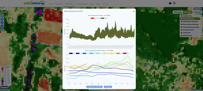
Note: These graphs are generated on land parcels. Selecting a different land parcel within the property boundary may result in reshaping of the graphs. Users can only generate graphs for the property (land parcels) associated with their LPA account. graphs cannot be generated for neighboring properties, shires or regions.
To obtain a whole property scale series of charts, click on the front gate location associated with your property 'front gate'.
You can also download the TSDM data into a csv file by clicking on the blue 'Download farm chart data' icon at the bottom of the chart pop-up window.
Dead Pasture Biomass
Dead Standing Dry Matter (DSDM) is defined by the amount of non-photosynthetically active plant material, such as dead leaves and stems, in kg/ha. This is the dead component of the TSDM.

This layer can assist landholders to obtain a visualization of the seasonal influences and potential digestibility components of different areas of there property. This may assist in decision support for allocation of livestock to different areas of the property or to assist in making decisions for additional supplementation and stocking rate programs.
Green Pasture Biomass
Green Standing Dry Matter (GSDM) is defined by the total amount of photosynthetically active growing plant material in kg/ha. This is the green component of the TSDM.

This layer enables the user to simply and easily be able to obtain visualization of changes across their property. These changes for example could be due to seasonal impacts, natural disaster impacts, impacts of the change or effect of rainfall on plant pasture production across a whole farm level. It helps users understand what proportion of the pasture is actively growing in different conditions and at different sections of the property. This can assist with matching livestock grazing requirements with what is currently on the ground.
Fractional Cover
Fractional cover is expressed as the percentage of land covered by photosynthetically active vegetation (green), non-photosynthetically active vegetation (dead or dry), and bare ground. The three proportions add to 100%. Vegetation includes all grasses, forbs, shrubs and trees.

Pasture Biomass Deciles
This layer displays the ranking of the current month’s Total Standing Dry Matter (TSDM) relative to all the previous estimates for that month over the length of record since 2017.
A decile of 1 means the current month's pasture biomass is vastly below average. A decile of 2-3 is below average, 4-7 is average, 8-9 is above average, and 10 is vastly above average.

Woody Cover
You can also explore and compare changes in woody cover on your property using the AFM.
This imagery demonstrates the change in Primary and Secondary Forest and Woodland.
The imagery shows the changes in woody cover over a one-year period. A forest is woody vegetation with a minimum 20% canopy cover (CC), potentially reaching 2 meters high and a minimum area of 0.2 hectares. Woodland is defined as woody vegetation with a canopy cover between 5-19%. Primary forest or woodland is defined as woody vegetation that has existed since 1988. Secondary forest or woodland has been disturbed at any time post-1988.
This data is sourced from the Department of Climate Change, Energy, the Environment and Water (2023).

Total Cover
You can also select 'Total Cover' to compare changes over time in Ground Cover levels across your property.
This is expressed as the combined percentage of ground covered by green, dead and dry vegetation, including grasses, forbs, and woody plants like trees and shrubs.
Total Cover % = green cover % + dead or dry cover %.
OR
Total Cover % = 100% - Bare Ground %.

Satellite View
This image is a composite made from all available cloud-free Sentinel-2 data from the previous 35 days. It displays bands 11 (SWIR), 8 (NIR), and 4 (Red) as red, green, and blue, respectively.
In the image, bright green represents vigorous, healthy vegetation such as forests, crops, and growing pastures. Dry forests and woodland appear in muted green through to browns, while sparsely vegetated, dry pasture and bare areas appear brown to pale purple, showing variability in soil colour.

If you would like further information on how to make the most of this tool, please don't hesitate to email support@cibolabs.com.au for assistance.